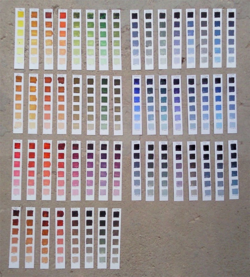
Why make colour charts?
There are several compelling reasons why I wanted to make my own colour charts. It all boils down to what I knew I would learn in the process:
- Learning to mix different colours. This sounds simple but it was one of the things I found most difficult when first starting to paint, (this is still the aspect I struggle with the most).
- Familiarity with the consistency and tinting strength of the colours on my palette.
- Discovering the range of colours that can be acheived with my palette.
- Seeing for myself the effect of different whites in mixes.
- Creating a set of swatches of my palette for future reference.
My palette vs your palette
Some of what I learnt in doing this relates to colour mixing generally, e.g. prussian blue is scarily strong, but much of it was very specific to the pigment, brand and mixes of paints I used, e.g. gold ochre has a much higher tinting strength than yellow ochre.
I made colour charts to get to know how my palette behaves, so referring someone else’s chart is not going to help you understand your palette, though you might learn something about theirs. The same principle applies to those little plastic colour wheels, they are a good starting point to learn basic colour theory but they can’t tell you anything beyond that about how your pigments will behave.
How to make colour swatches.
The method I chose to begin with is loosely based on the one from Richard Schmidt’s Alla Prima book. I wanted to start with this to get a good overview of my palette, as well as the more general reasons for making colour swatches.
Materials
- Oil paint
- Palette
- Palette knife*
- Rag or tissues for cleaning knife.
- Oil paper or preferred prepared surface.
Some people like to use the surface that they normally paint on. I particularly wanted to make a swatch that would fit in my paint box so I used oil paper that can easily be cut down.
* You can use a brush but you will be cleaning it every few seconds, I used a palette knife because it’s much easier to clean. If you use a brush and don’t clean it properly all your mixes will be contaminated with other colours. If this happens, consider that you have just learned a valuable lesson about the importance of cleaning your brush.
Method
Draw and cut out a grid from a piece of scrap paper or card, make it at least 5 squares deep by as many colours as you would like to chart. If you have a large palette select 6 or 7 of your most frequently used colours, to give you a 5 x 6 or 5 x 7 grid to begin with, you can always do more later. Draw through your grid, marking out boxes onto your preferred substrate. I used one 5 x 7 sheet for each of the 7 colours I chose, giving me 7 sheets (I then cut these down into smaller strips to fit in my paint box):
Alternatives for setting up the grid include masking tape (lots and lots of it), or a cleanable mask template. Filling in the drawn boxes requires a little more care than those which are masked-off but I saw learning to put the paint where I wanted it to go as a bonus lesson.
The first column of each sheet begins with the undiluted tube colour, your key colour for this sheet, this is then progressively tinted with white, in as many steps as you wish.
I did 5 steps initially, then added a further one with a different white to see how that changed the value, tone and opacity.
Clean your palette kinfe thoroughly after each column and your palette as needed.
For the next column mix the original tube colour with some of your first palette colour, put this full strength mix in the first row of column 2, progressively tint this mix with white.
Clean your palettte knife again.
For column 3 mix the original tube colour with your second palette colour and proceed as above.
Continue for each subsequent palette colour until you finsh the sheet. Move on to the next key colour, working through your palette colours again, it is important to keep the palette colours in the same order, especially if you want to keep them your swatches in full sheets. Label the strips as you go.
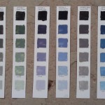
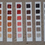
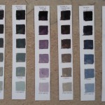
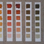
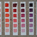
Here are a few of min, click to see the full sheets:
Some interesting observations about specific colours and pigment families:
- Ivory black is really blue.
- Paynes grey is mostly ivory black, it mixes very similarly but warmer than the black.
- Both my transparent red and transparent yellow are very cold.
- Black can make some lovely colourful mixes.
- Titanium white is very flat and cold.
- The iron oxides are a close knit family – this was the cause of my biggest revelation:
Red + blue = Green!
No I’m not kidding. I mixed transparent red oxide with prussian blue, the result is below:

(Transparent red oxide + prussian blue = green)
Okay so that’s probably cheating because prussian blue is already quite green but it just goes to show that pigments don’t always do quite what you mught expect.
The limitations of colour swatches
I found this an incredibly useful starting point but all of my carefully judged mixes look entirely different as soon as I put them on my painting. The cause is simple, colours interact with and visually influence other colours. It’s called the principle of simultaneous contrast, more on that another time.
Doing colour charts will also help with this since it will give you the tools to better adjust your mixes when they don’t look as expected on your canvas. I’ll be making more of these soon because my palette has changed significantly since these charts.
Try making Red + Blue = Green and let me know how you get on in the comments.
Hi Helen,
you’ve started on a very useful process with your colour mixing swatches. Almost no-one ever gives themselves time to do it, and you learn so much! Try ‘cross-mixing’ any two colours from your usual palette – start with tube colour A at one end, and add increments of colour B (as many as you like, but try for consistency) until you get to tube colour B at the other end. It is a contemplative and really valuable exercise, filled with surprises and discovery.
It’s interesting how brands differ in their effect, too; I use the exercise to wean students away from ‘student’ colours – all binder + cheap pigment – which are hopeless for anyone serious about what they do!
Thanks for you comment Chris,
Yes, process is definitely the word for it!
Brand comparison is also fascinating, even across the mid-higher end of the ranges where the same pigments (based on the pigment codes) give hugely different results; raw umber for example from very green to warm brown, I might post some images on that soon, as I (somehow) seem to have several examples! I find the relationship between natural and synthetic version of a pigment to be another fruitful area for investigation, natural vs synthetic red oxide is a good case in point.
I’m also planning to attempt to grind some pigment myself; I have some very interesting looking ‘purple ochre’ from Clearwell, though I think the resulting paint is more usually called caput mortum.